
I was first introduced to the mind of Sunni Brown at SXSW 2010 conference where she was on the Visual Note-taking 101 panel along with Mike Rhode, Dave Gray and Austin Kleon. The most impressive thing about the panel was how engaged they were with the audience. Everyone in the room was following along, learning to draw, etc. It was a lot of fun to watch.
While I did not get to meet Sunni at the conference, I tracked her down a couple weeks later and told her she needed to hire me, so she did.
We recently launched Sunni’s new website and made a lot of changes. Here’s a few:
We helped explain what she does
“Graphic Facilitation” is the technical term for what Sunni does. Unfortunately, this means nothing to most people. We needed to break down the all encompassing phrase of “graphic facilitation” into bits that people can understand and clearly see the benefits of working with her team. Here’s what we did to get over this hurdle:
- Added a tagline to the top of the site with a clear explanation.
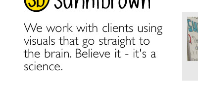
- Instead of a typical “Services” page, we decided to called it “What We Do“. We wanted people to easily find out what Sunni and her team does. Since the launch of her new site, this is the second most visited page on the site.
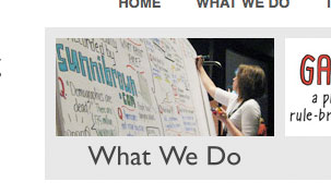
- On the “What We Do” page, instead of focusing on words like “Infographics” and “Graphic Facilitation”, we broke it down into the problems she solves:
- We visualize complex ideas
- We help you tell your story
- We facilitate groups using visual problem solving
This helps break down the technical aspects of what Sunni does into things that most people can understand and identify with.
Here’s a few more things we did on Sunni’s new site:
- We had Sunni hand draw her logo and other elements of her site. This gives a creative feel to the site without going overboard with distracting design. It gives a visual representation of what she does while keeping her site clean and professional.

- Made her blog much easier to browse through while also keeping her images front and center. The latest post is at the top, nice and big with her latest art piece prominently displayed. When you scroll down or browse the archives, there is a thumbnail image with each post.
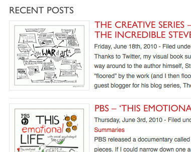
- Made it much easier to share her posts and art across Facebook, Twitter, etc.

- Made it much easier and more prominent to sign up for her email newsletter (every author’s most prized community building tool!)
- Added the three boxes at the top to highlight the three most important things Sunni is working on.

- Added social proof – all the great companies Sunni has worked with.

With these changes to Sunni’s website we were able to make it easier to see her artwork, understand what she does and stay in contact with her. Let us know what you think!


Leave a Reply